My SeCan
My SeCan is a member platform designed for Canadian farmers and distributors to manage their seed business with SeCan. The goal was to enhance user experience by consolidating key features—such as profile management, sales history, product information, and event updates—into a centralized, intuitive dashboard.
Project
Work Project
Role
Date
-
UI/UX Designer
-
Programmer
December 2022 - March 2024
The challenge
-
SeCan members relied heavily on email and phone calls for basic tasks like:
-
Editing their profiles
-
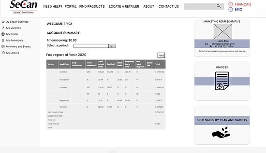
Accessing sales history
-
Getting event details or documents
-
-
This process was time-consuming and led to:
-
Delayed responses and user frustration
-
Increased administrative workload for SeCan staff
-
-
There was no centralized platform for members to manage their interactions independently
-
The user experience lacked efficiency, intuitiveness, and accessibility across devices
The Solution
-
Developed a user-friendly dashboard tailored for an older farming demographic
-
Centralized key features in one accessible platform:
-
Profile management
-
Sales history
-
Event updates
-
Certificates and logos
-
-
Designed with simple navigation and clear labels for ease of use
-
Placed essential tools on the homepage to reduce confusion and clicks
-
Reduced administrative burden by enabling members to self-serve
My role
-
Redesigned the platform’s UI with a strong emphasis on usability and visual hierarchy, specifically considering the needs of SeCan’s predominantly older member base.
-
Developed interactive components and contributed to front-end implementation using Drupal.
-
Created wireframes and mockups for dashboards, product modules (e.g., “My Varieties”), and certification access.
-
Collaborated cross-functionally with internal stakeholders to align platform features with both business objectives and user expectations.
-
Supported the launch through QA and design refinements, incorporating early feedback from real users, many of whom had lower digital literacy.
*Because of a confidential agreement in place, some information has been redacted. Please contact me for an interview to discuss more about the outcomes and designs.
The process
01 | Focused on minimal layout with collapsible menus for ease of use.
.png)
02 | Maximized screen real estate with more detailed cards and quick-access widgets.
01.1 | Introduced the “My Varieties” module, enhancing access to product-specific content.
.png)
03 | Added personalization and filtering to improve usability.

04 | This low-fi screen shows the structure of the final product. It has a menu, and more sections on the front page that are clickable and opens the link to more pages. This facilitates the user's navigation of the site and makes their experience more enjoyable.
.png)
key features implemented
-
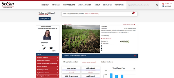
My Varieties: A personalized module for viewing seed varieties, downloading logos, and accessing certifications.
-
Dashboard Notifications: Clear, timely reminders for events and important updates.
-
Sales History: Easy-to-access tools for viewing and exporting sales-related data.
-
Streamlined Navigation: Simplified menu structures and clear labeling, optimized for older users to reduce cognitive load and improve discoverability.
-
Reduced reliance on email and phone support by empowering members to self-manage profiles, documents, and updates.
-
Enhanced usability led to increased confidence among less tech-savvy users.
-
Improved operational efficiency for both members and internal SeCan teams.
-
Delivered a scalable, user-centered experience that continues to serve SeCan’s nationwide farming community.
Final Designs
.png)
A little scroll

A little scroll
